Project Overview:
The branding for Urban Grind Coffeehouse was designed to embody the essence of high-quality, uncomplicated coffee. The logo reflects a strong visual identity that speaks to coffee lovers who value authenticity and a no-nonsense approach to their coffee experience.
Design Concept:
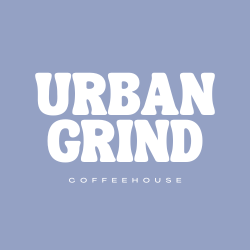
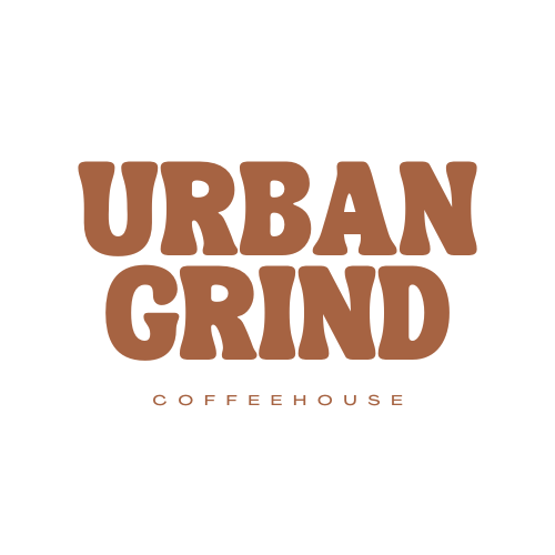
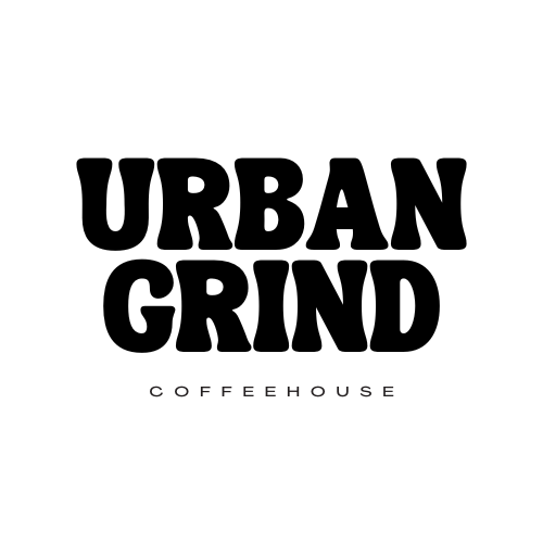
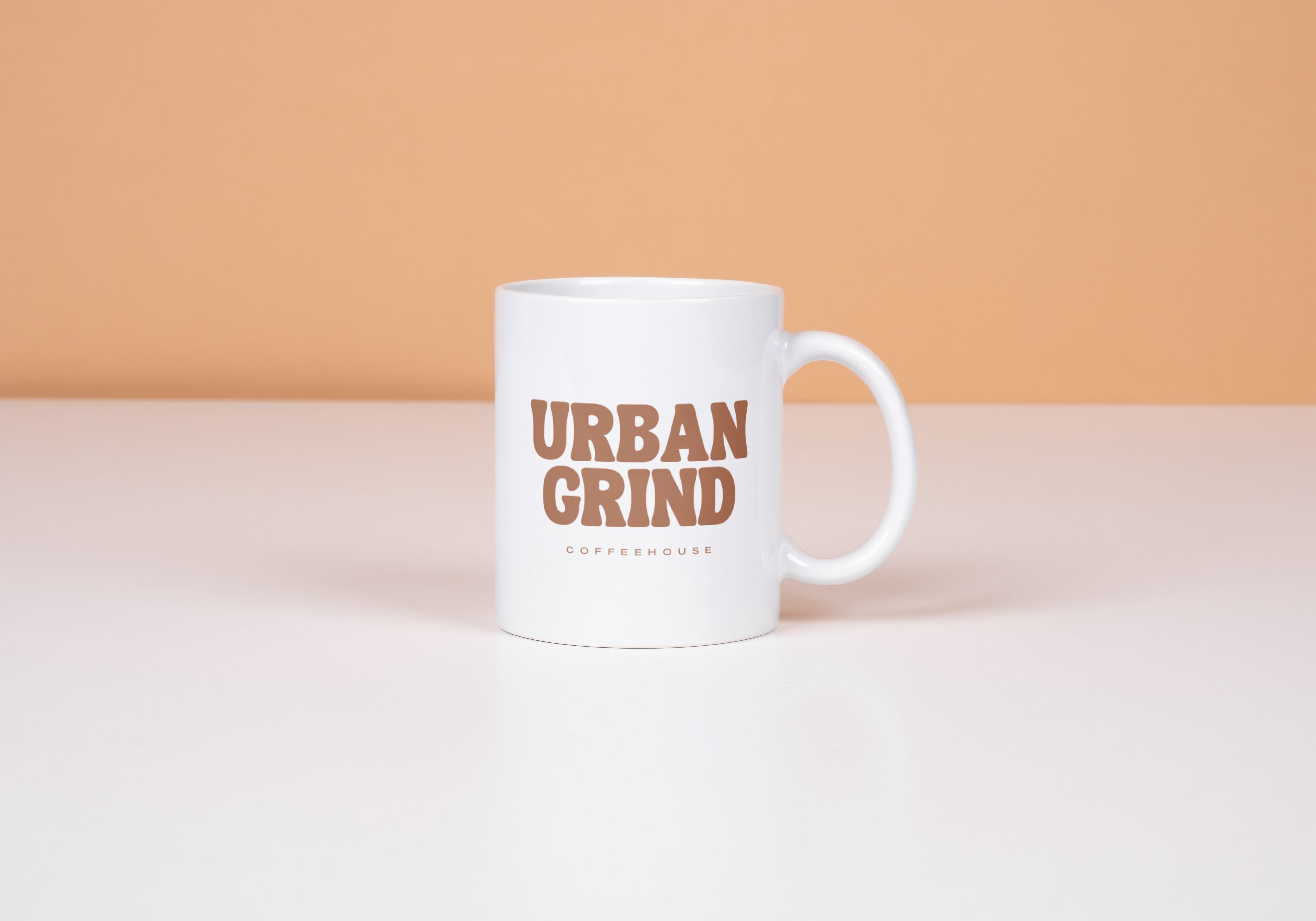
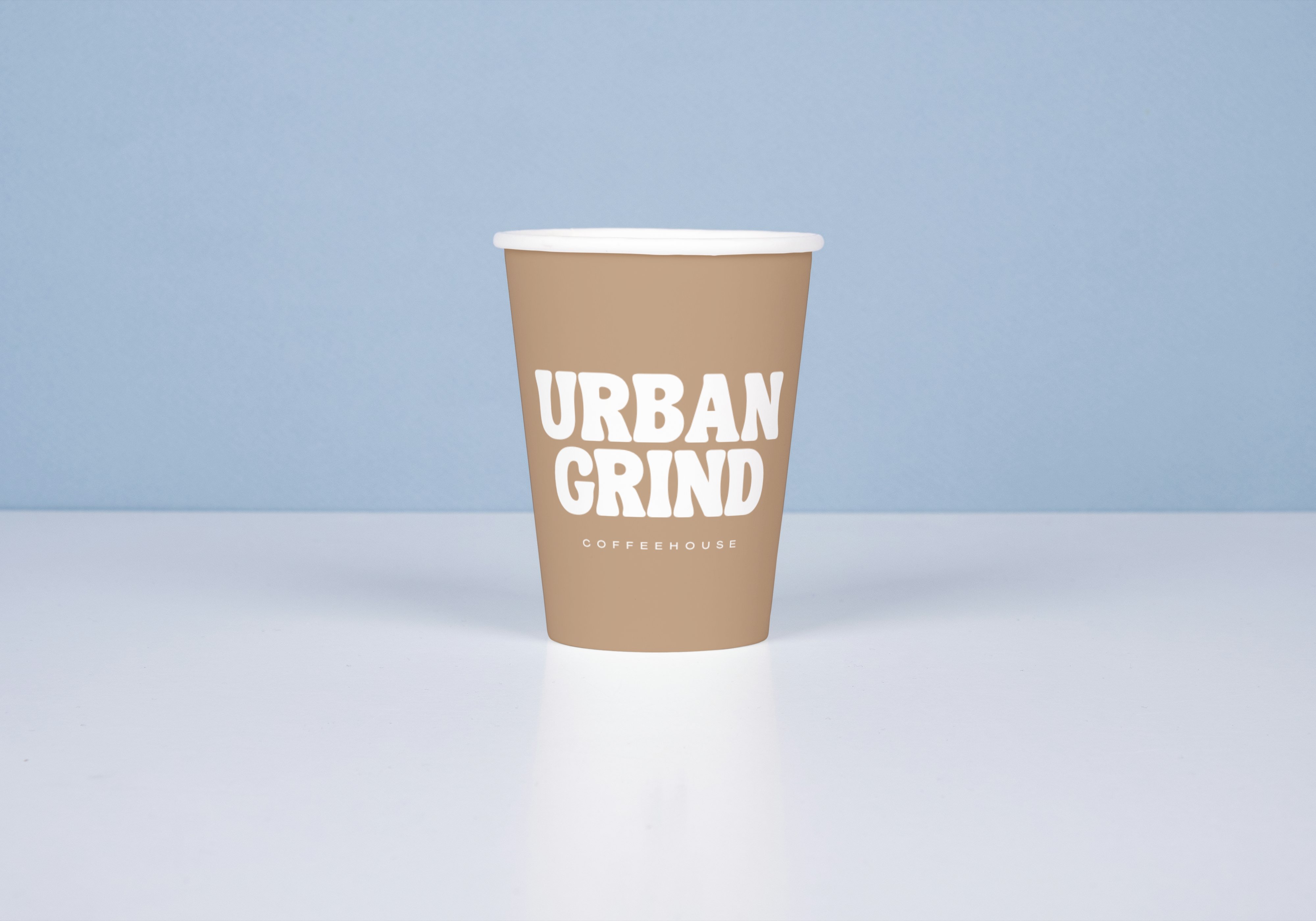
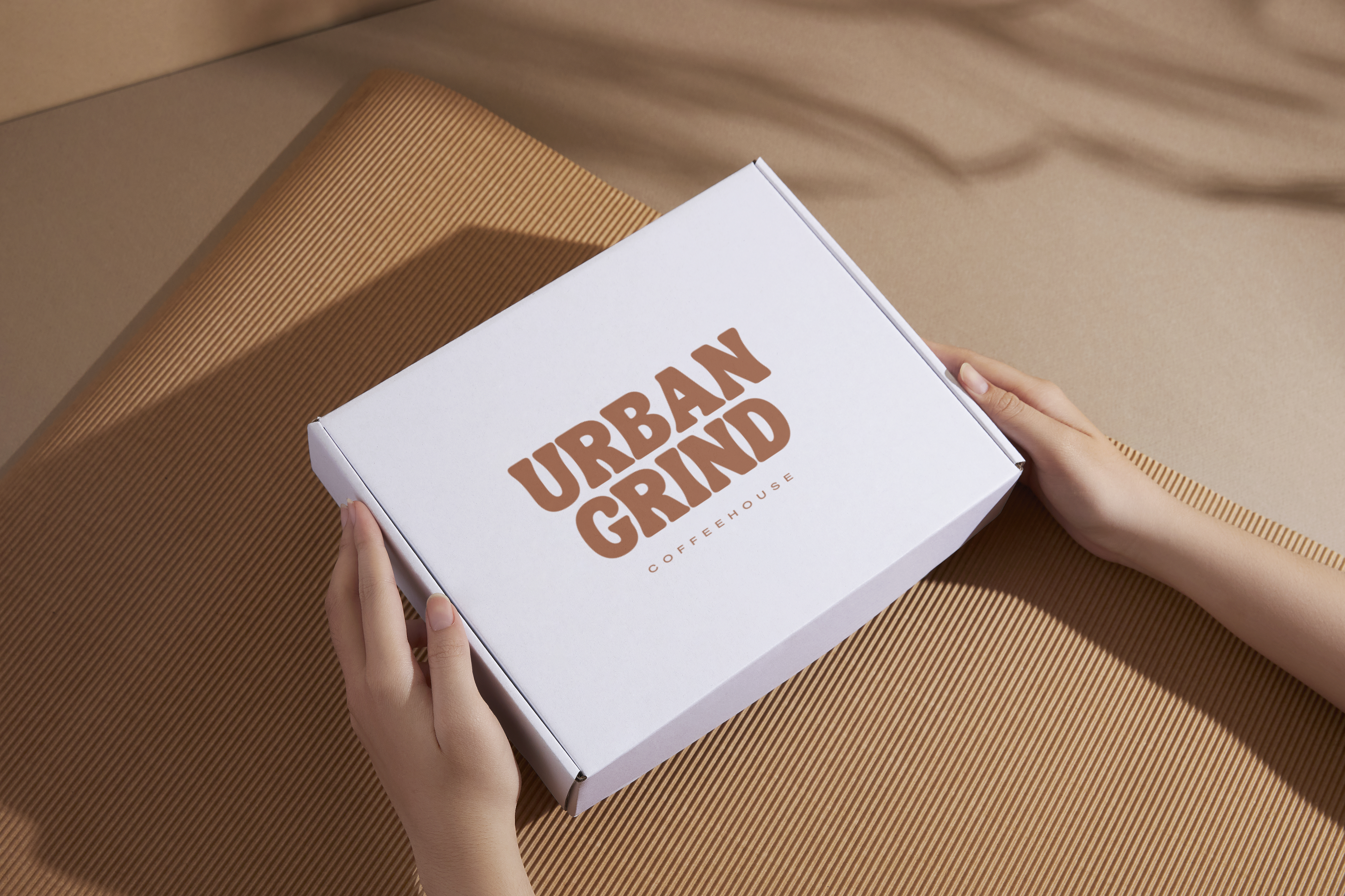
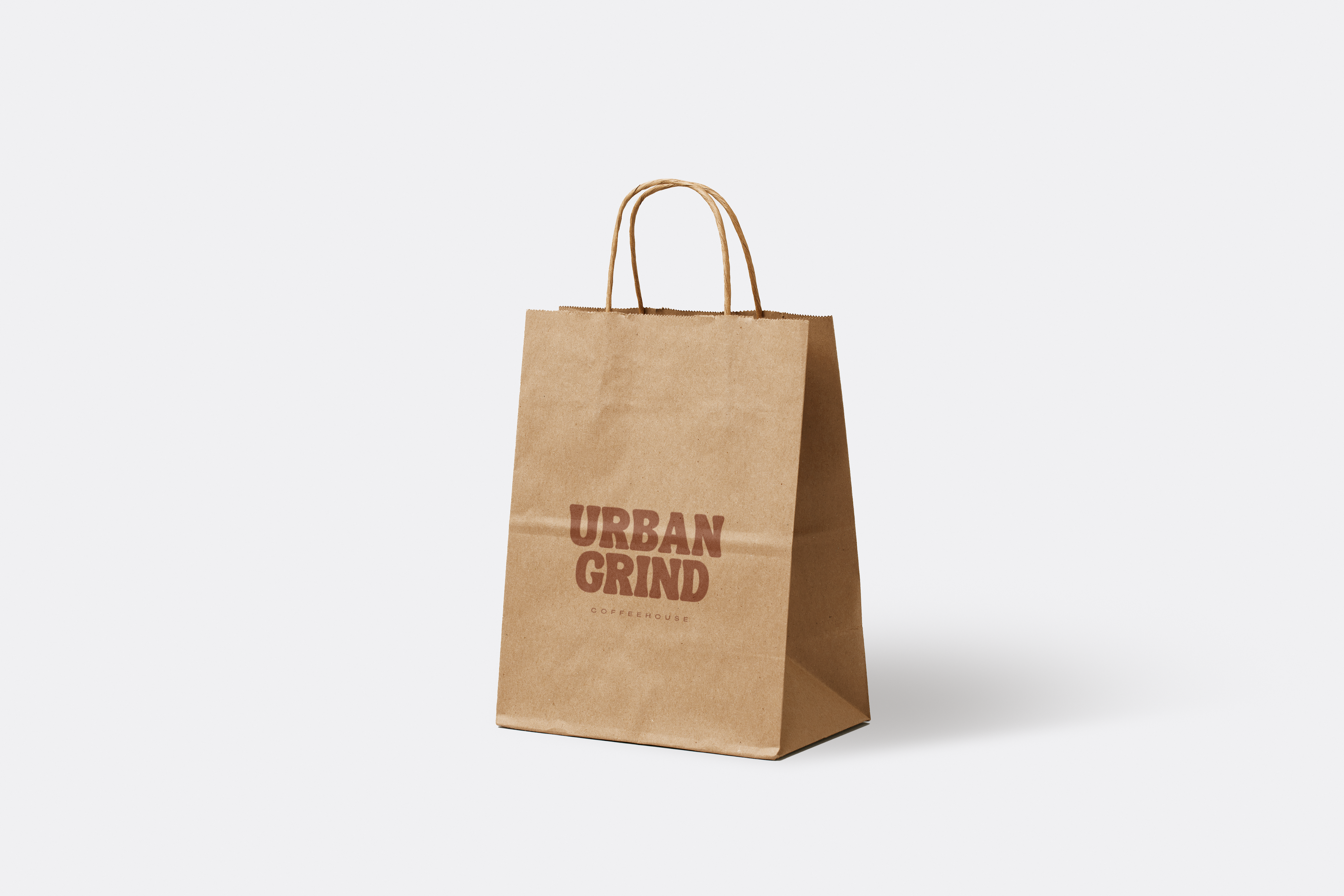
The bold and rounded typography used in the logo conveys a sense of warmth and approachability, much like the coffeehouse itself. The earthy tones in the colour palette were chosen to resonate with the natural richness of coffee beans, creating an immediate connection to the product. The word "COFFEEHOUSE" in a minimalist, clean font provides a subtle contrast that emphasizes the brand's modern and refined qualities.
Versatility and Application:
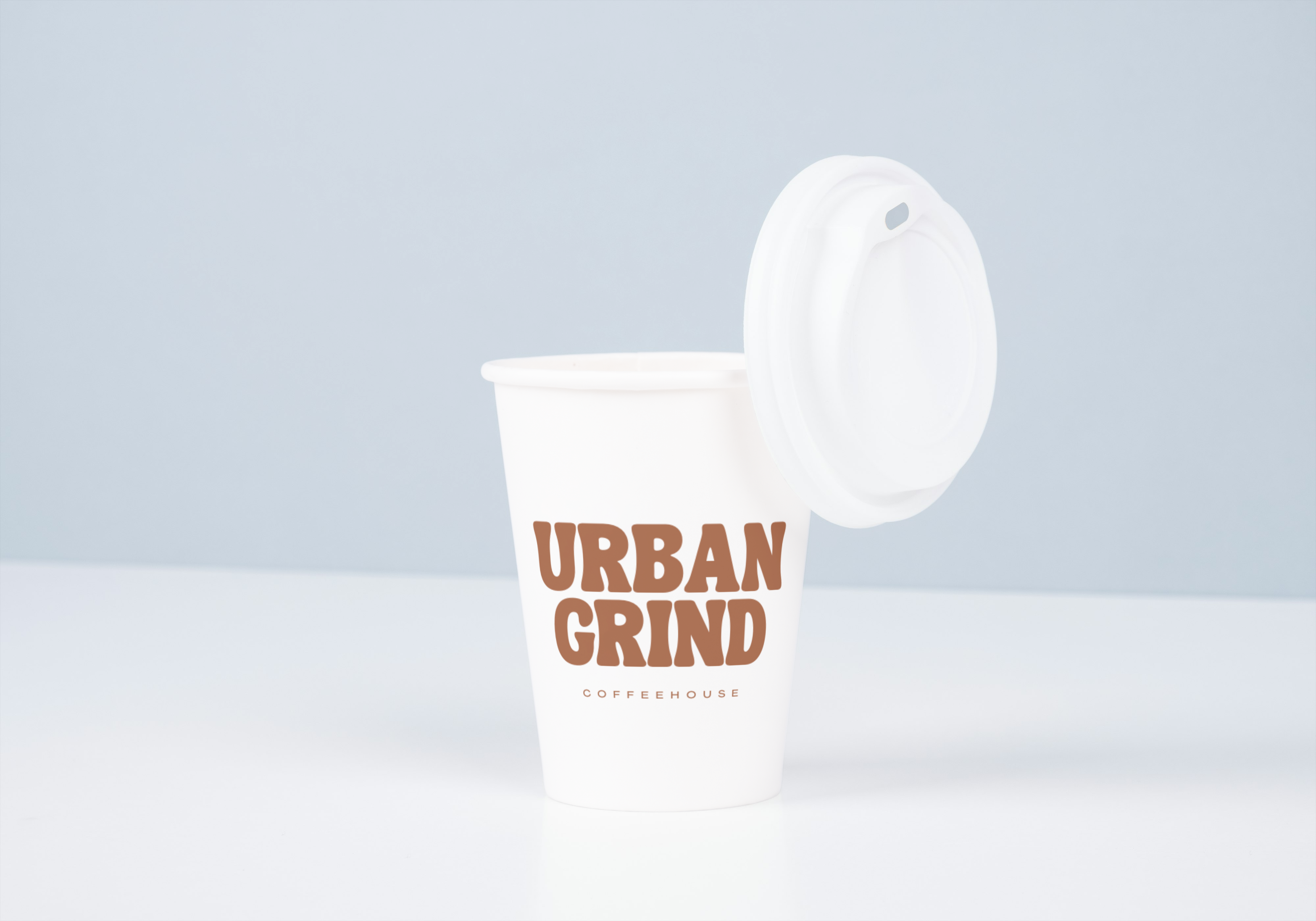
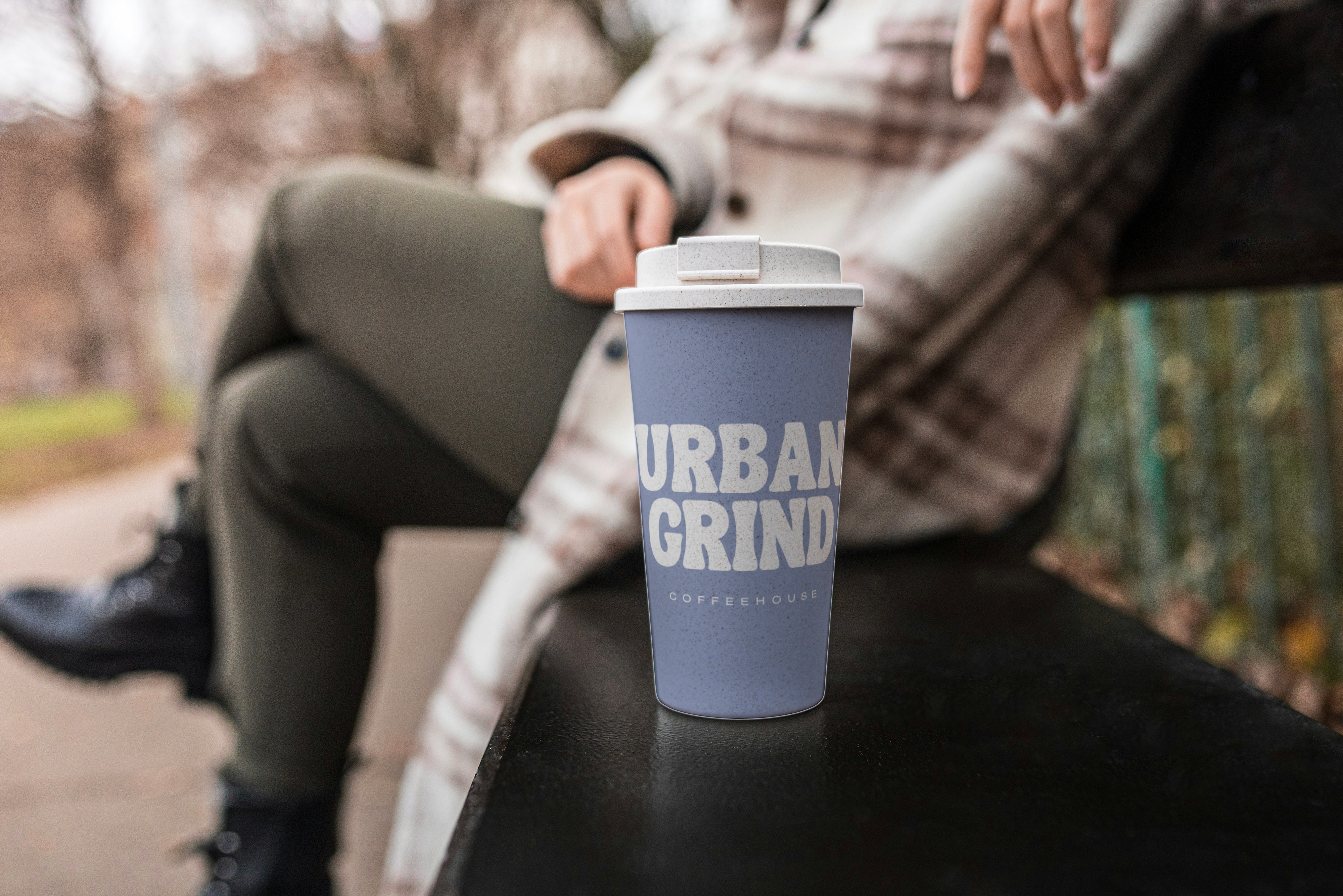
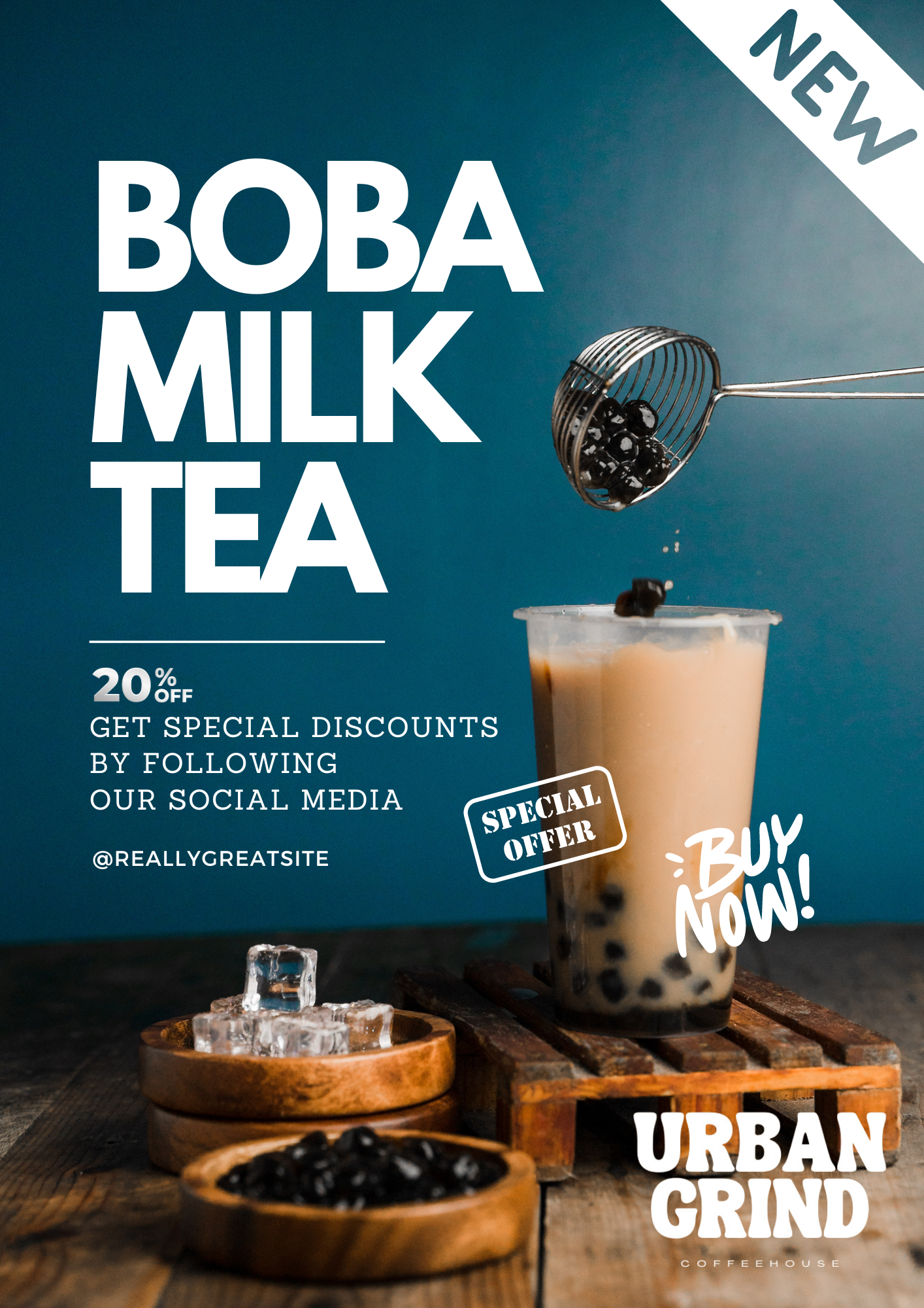
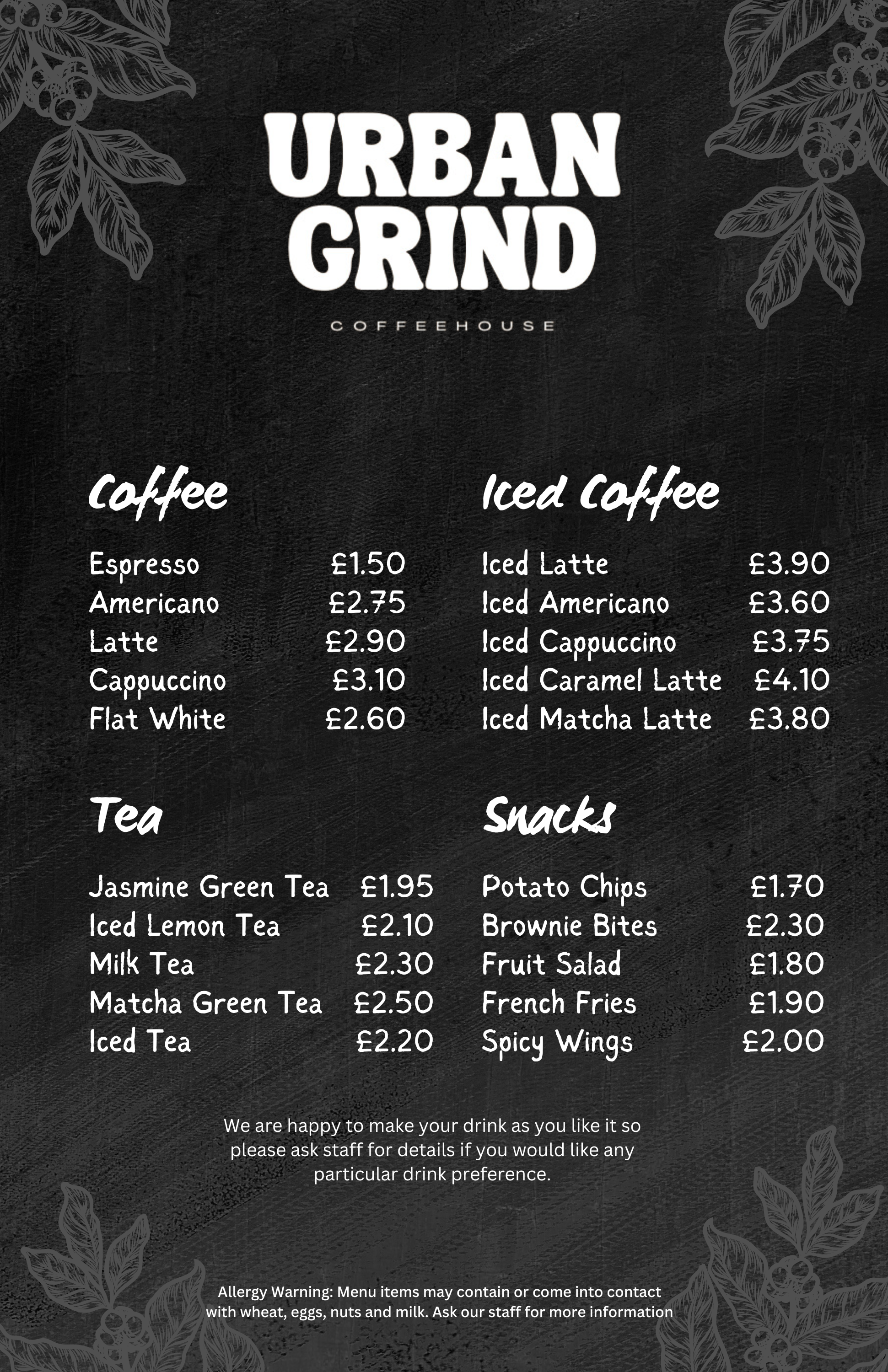
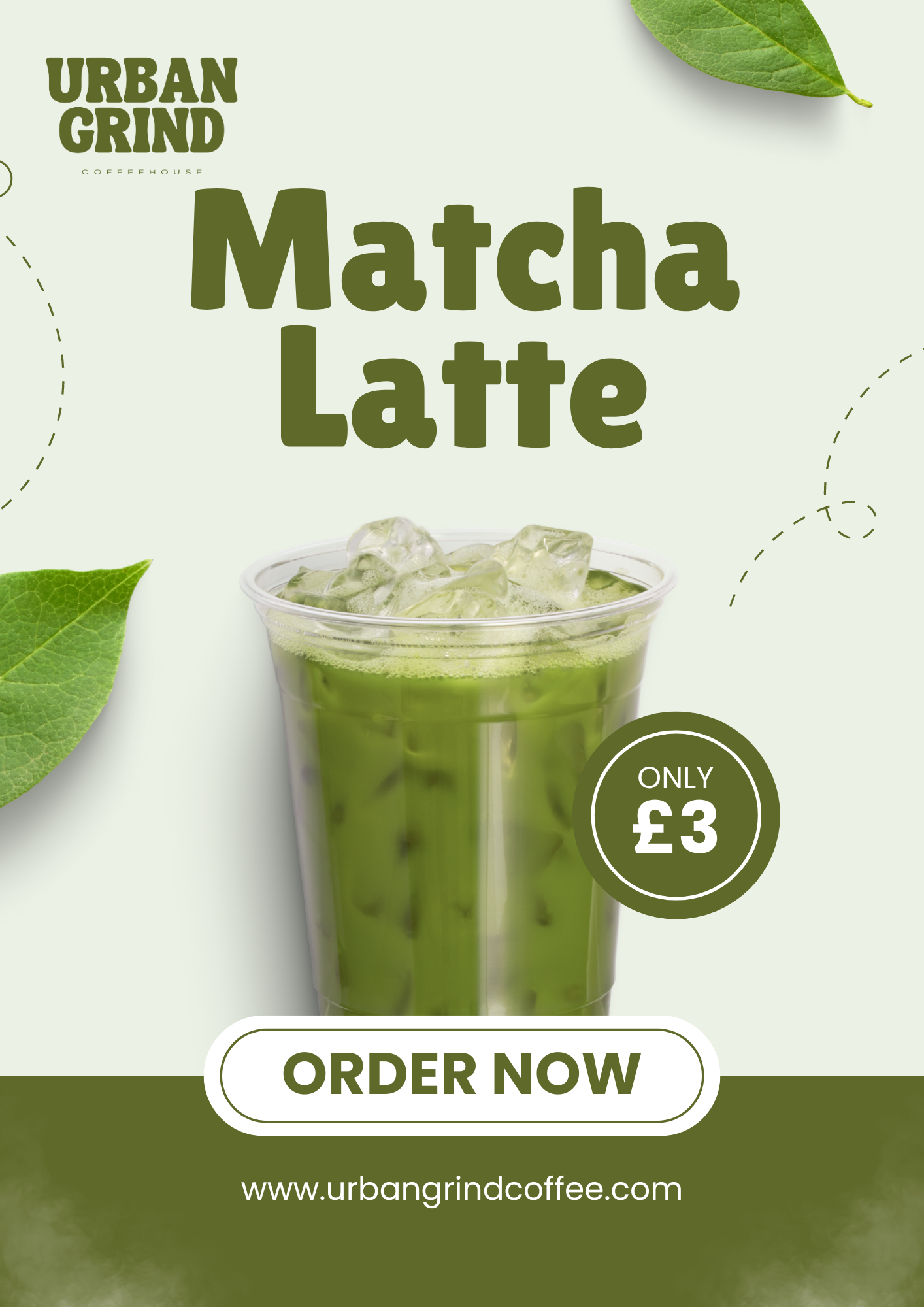
This logo was designed with versatility in mind, ensuring it works seamlessly across various mediums. Whether it's on coffee packaging, tableware, takeout cups, bags, or digital platforms, the Urban Grind branding maintains its strong presence and recognizability. The simplicity of the design allows for easy scalability and adaptability, making it suitable for both large-scale and small-scale applications.
Conclusion:
Urban Grind Coffeehouse's branding is a perfect blend of modern simplicity and classic warmth, appealing directly to those who appreciate a premium coffee experience. This design successfully captures the brand’s identity, making it a cornerstone of Urban Grind’s visual presence both in-store and online.