Oast House Menu Design
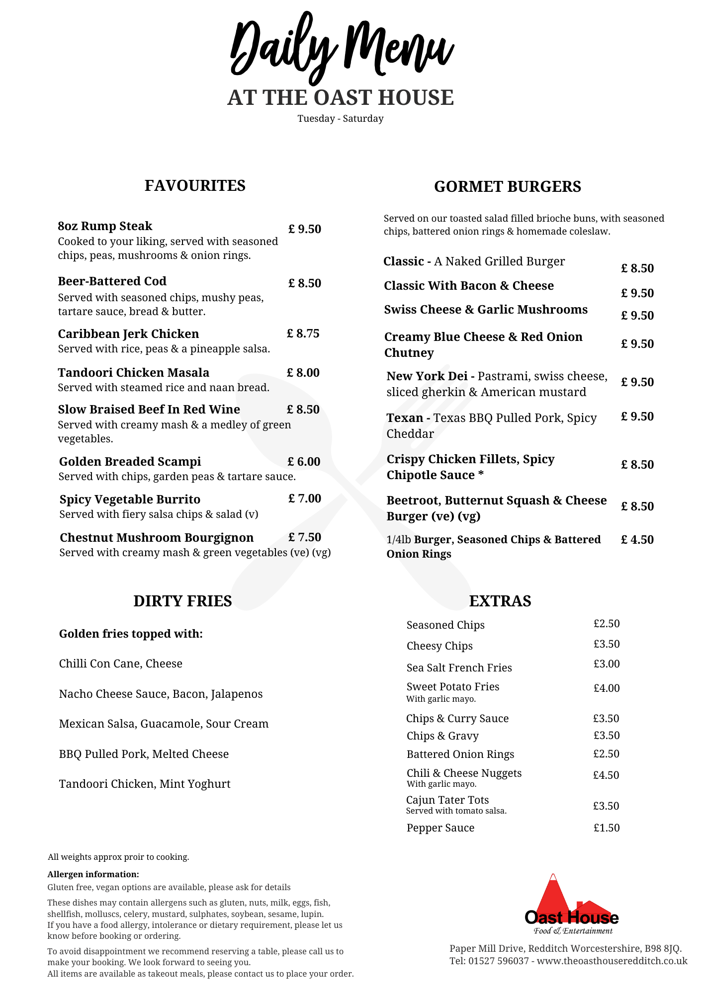
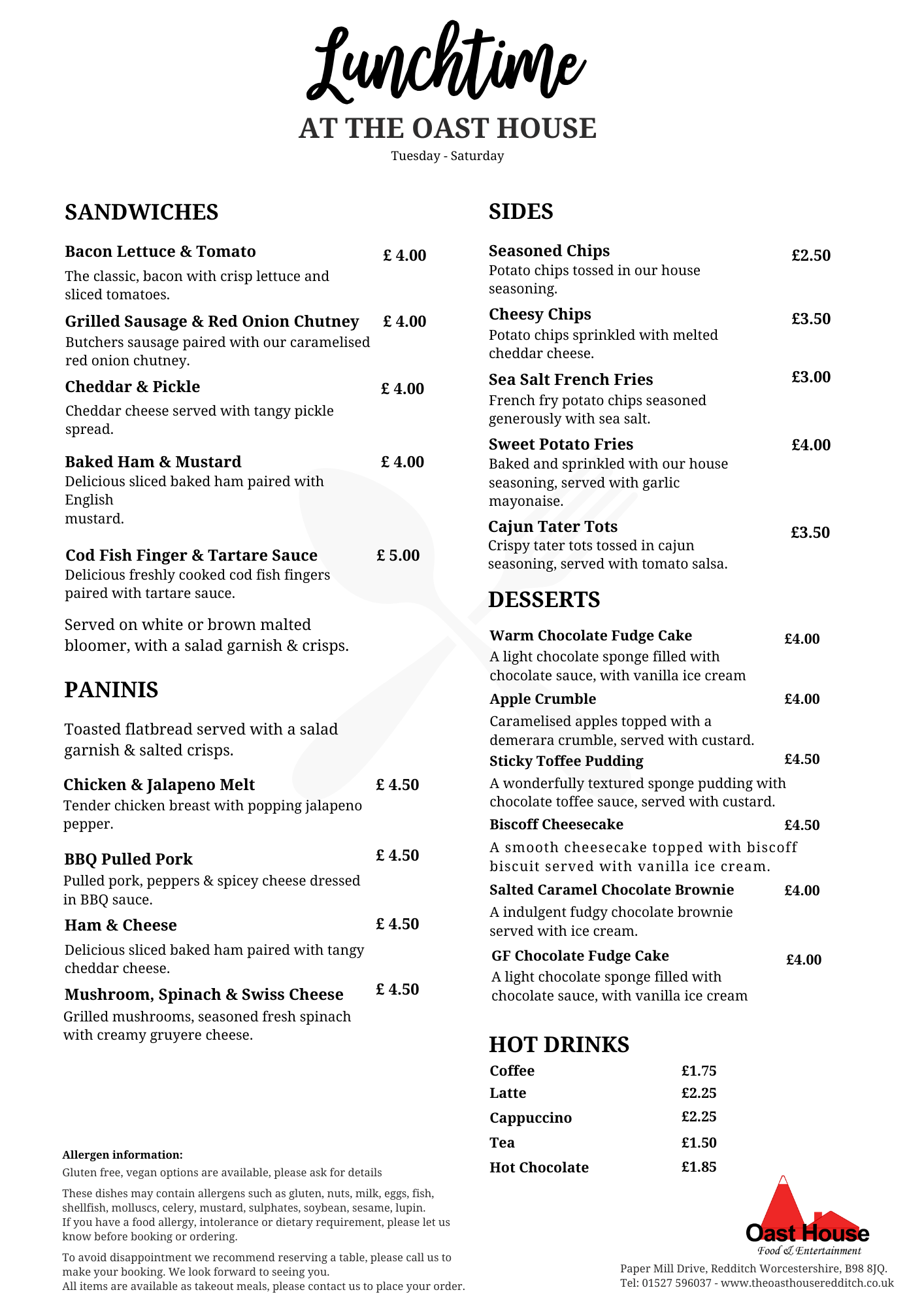
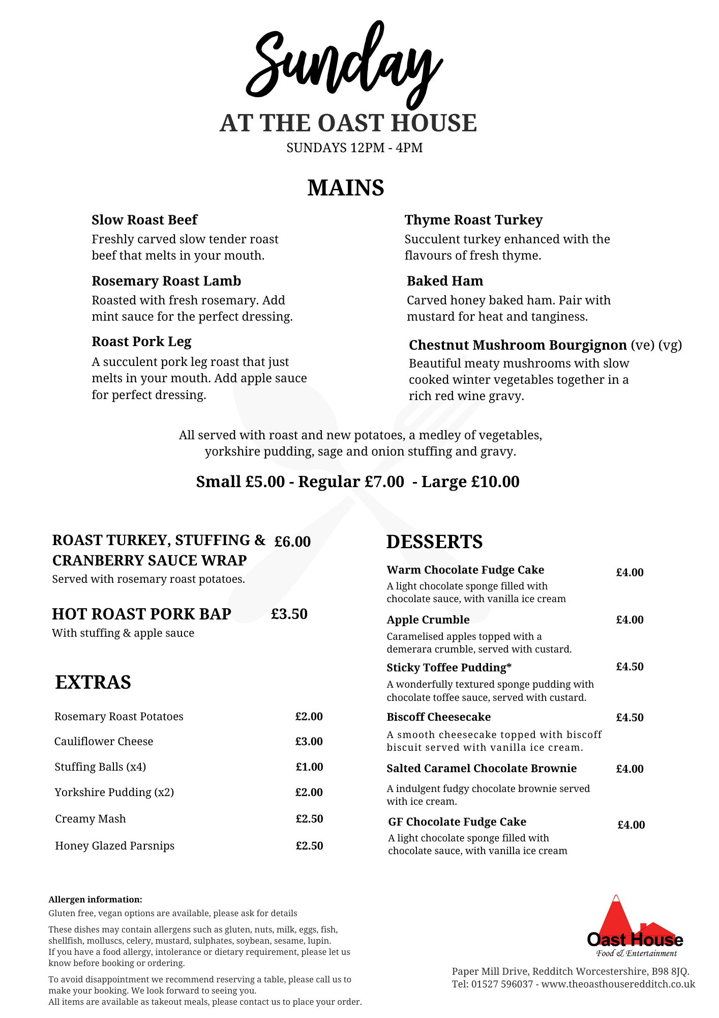
The Oast House: Custom Menu Designs
We collaborated with The Oast House to craft a full suite of menus tailored for a variety of dining experiences, leveraging their established logo and colour scheme to create cohesive, visually appealing designs. Each menu—whether for daily use or special occasions—was carefully designed to reflect the venue’s rustic charm, enhance the dining experience, and ensure brand consistency across all formats.
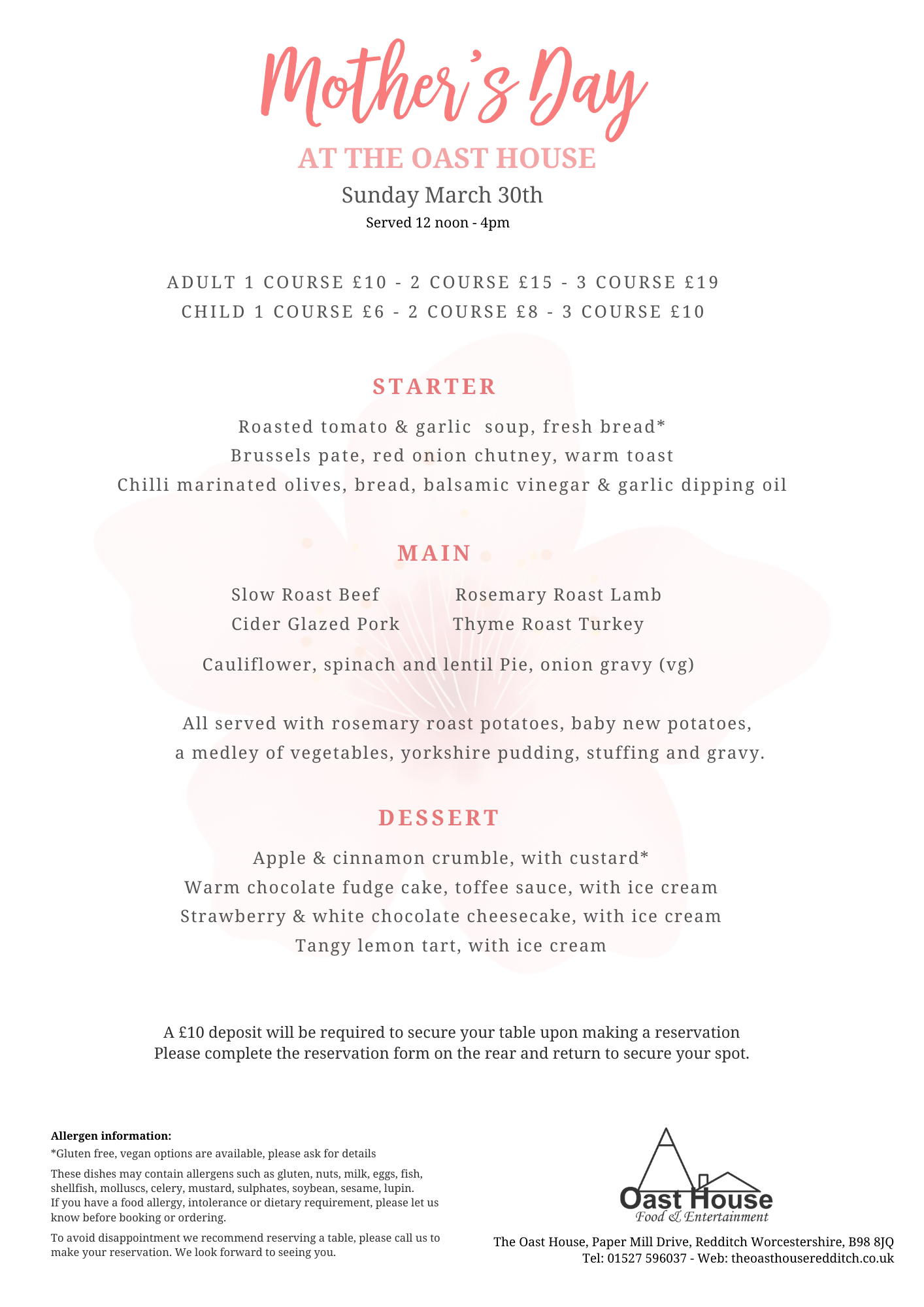
For the 2024 festive season, I was tasked with designing the Christmas menu for The Oast House, a charming venue offering a cosy yet sophisticated dining experience. The goal was to capture the warmth and joy of the holiday season while maintaining a clean and elegant aesthetic to appeal to both new and returning guests.
Design Concept:
The design follows a minimalistic, yet festive theme, combining traditional Christmas elements with a modern layout. The colour palette is cantered around warm oranges and soft greys, punctuated by light snowflake patterns that evoke a sense of winter festivity without overpowering the content. The use of whitespace helps create a sense of clarity and sophistication, allowing the menu items to stand out.
- Typography: I used a combination of serif and handwritten-style fonts. The handwritten “Christmas” header adds a personal, welcoming touch, while the serif fonts for the menu items keep the layout professional and easy to read.
- Festive Visuals: The delicate snowflake illustrations frame the menu without overwhelming the content, creating a balance between festive cheer and elegance. These snowflakes, in various shades of orange, grey, and soft beige, subtly echo the warmth of a traditional Christmas, while keeping the design light and fresh.
- Layout: The three-course structure (Starters, Main Dishes, Desserts) is clearly delineated, ensuring easy navigation for diners. Decorative dotted lines and small snowflake icons serve as separators, maintaining visual consistency and helping guide the eye across the page.
- Colour Palette: The muted, earthy tones of orange and grey align with both the season and the rustic, welcoming atmosphere of The Oast House. The warm orange, in particular, is used to emphasize key text such as section headers and the invitation to enjoy the menu, reinforcing the festive theme without being too bold.
- Special Features: A key component of this design is the emphasis on clear communication regarding the allergen information, presented at the bottom of the menu in a clean and accessible way. Additionally, a highlighted callout box encourages customers to engage by booking, with the promise of a delightful dining experience awaiting them.
- The Oast House also requested a practical solution for streamlining the kitchen’s preparation process, which led to the inclusion of a booking form on the reverse of the menu.
Outcome:
The Oast House Christmas menu successfully marries festive charm with a clean, professional design. It captures the spirit of the holiday season while staying true to The Oast House’s brand as a welcoming and cosy venue. The thoughtful balance of typography, colour, and festive motifs creates an engaging, easy-to-navigate menu that enhances the overall dining experience for customers.


