


How To Ask Awkward Questions is a practical non fiction eBook written to equip ordinary citizens with the tools to challenge councils, police forces, and government departments effectively. The project required a strong editorial design that reflected authority, clarity, and confidence while remaining accessible to a broad audience. The aim was to position the book as both a serious guide and a usable handbook rather than a political manifesto or opinion piece.
Design Concept and Visual Direction
The visual direction was rooted in clarity and restraint. The subject matter revolves around accountability, precision, and uncomfortable truths, so the design avoided decorative or playful elements. Instead, it leans into bold typography, controlled contrast, and a minimal colour palette.
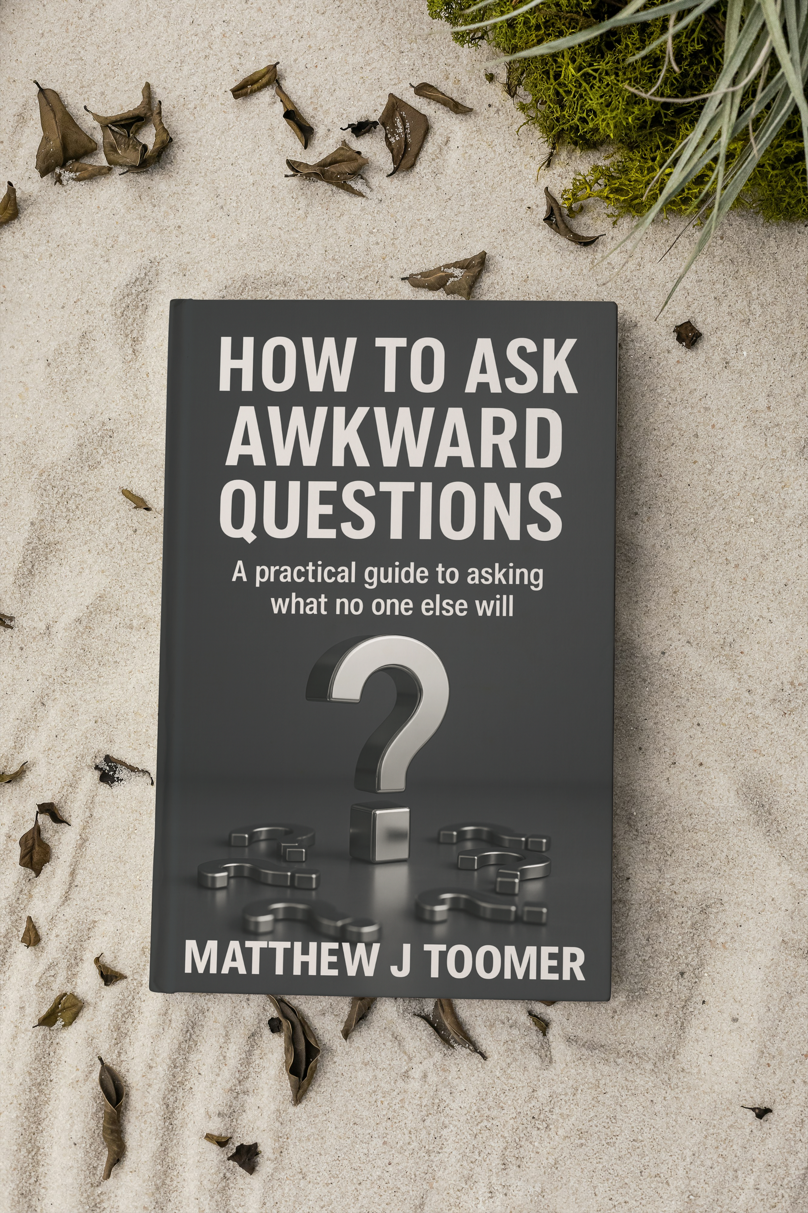
The cover centres on a single metallic question mark, grounded and dimensional, symbolising weight and consequence. The use of a dark background reinforces seriousness and depth, while the clean white typography communicates directness. The hierarchy is deliberate. The title dominates the composition, reinforcing the central theme of asking what others will not.
Inside the eBook, the layout follows a structured editorial approach. Clear headings, generous spacing, and disciplined alignment reflect the methodical tone of the content. The design mirrors the message of the book. Calm, precise, and strategic.
Key Features and Design Proposal
The design proposal focused on three core objectives.
Professional credibility. The book needed to feel authoritative and considered. Typography choices and layout spacing were selected to give the impression of a traditionally published non fiction title rather than a self produced document.
Readability and usability. Given that the book functions as a practical guide, chapters are clearly segmented with logical flow and consistent formatting. Readers can navigate directly to relevant sections without confusion. Each chapter stands independently, supported by strong structural cues.
Brand alignment. The author’s broader work centres on questioning institutions and holding public bodies to account. The visual language supports this positioning. Direct, uncompromising, and structured. The design reinforces the author’s identity as a writer who values clarity over noise.
The proposal also accounted for digital distribution. The layout was optimised for A4 PDF presentation and screen reading, ensuring that spacing and typography remain effective across devices.
Outcome and Client Feedback
The final result is a cohesive eBook that presents complex and potentially confrontational subject matter in a controlled and professional manner. The cover design immediately communicates theme and tone, while the internal structure supports long form reading without visual fatigue.
Feedback highlighted the strength of the typography and the sense of authority conveyed by the minimal visual approach. The design successfully positions the book as a serious guide for residents, taxpayers, and citizens who want structured, practical advice rather than opinion driven commentary.
The project demonstrates how disciplined visual direction can amplify subject matter. By avoiding excess and focusing on clarity, the design reinforces the core message of the book. Asking awkward questions is not about drama. It is about precision.
