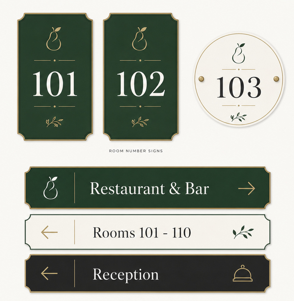
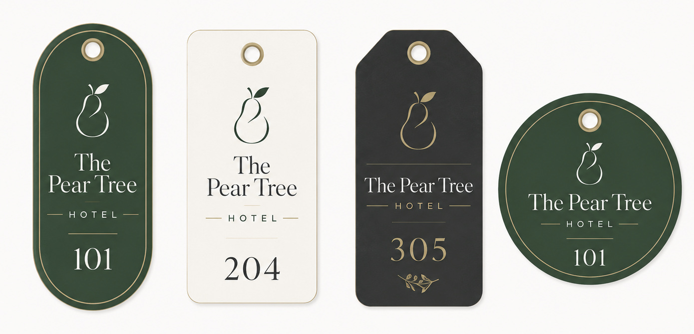
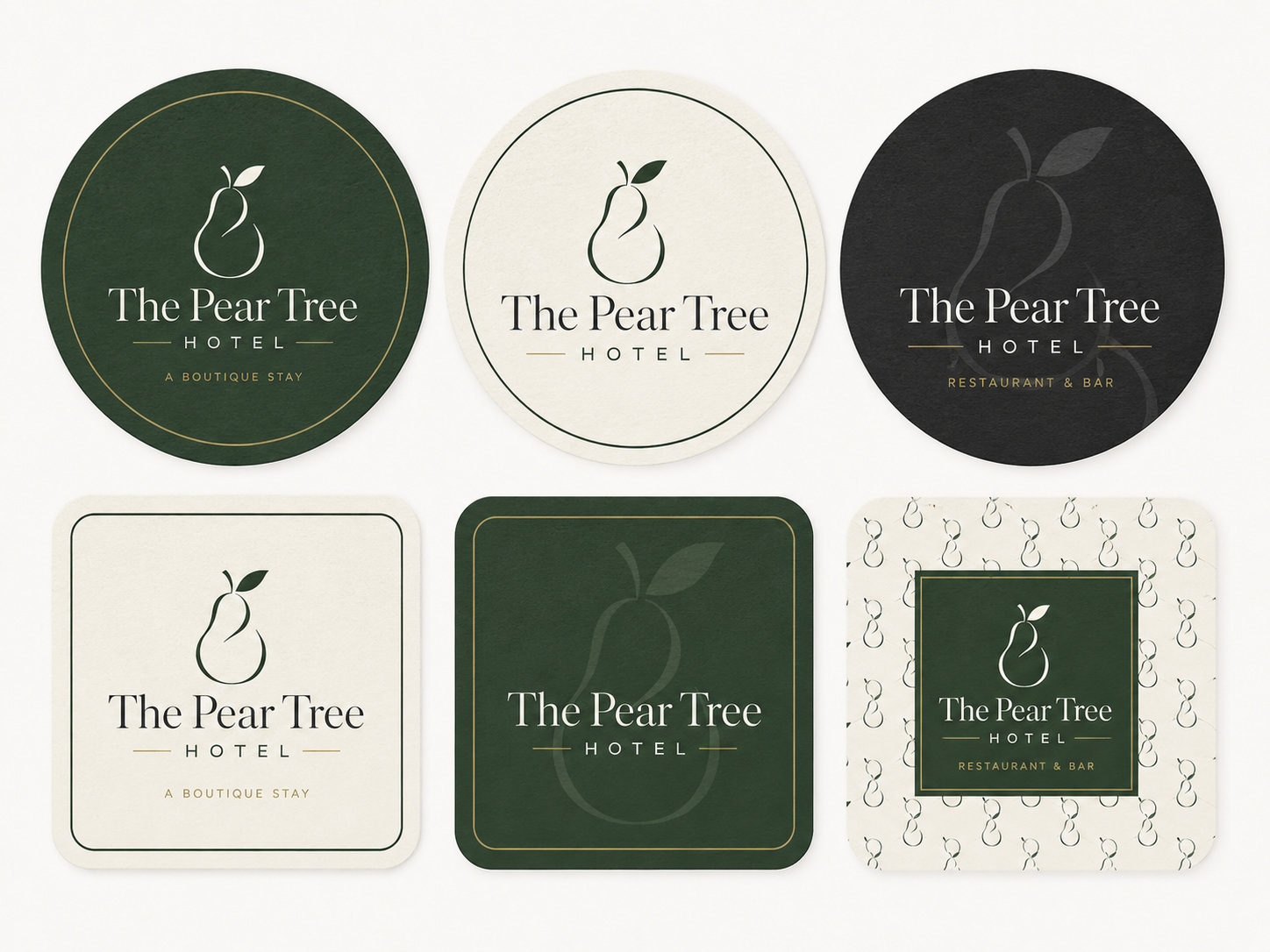
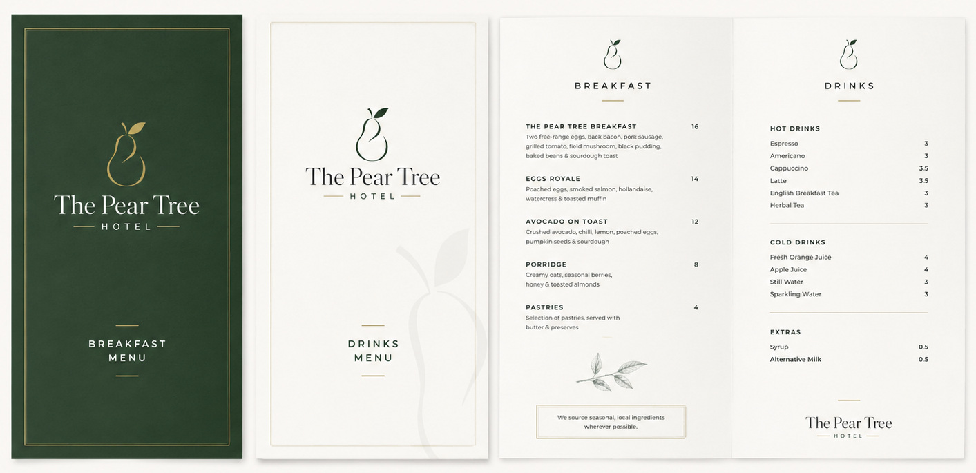
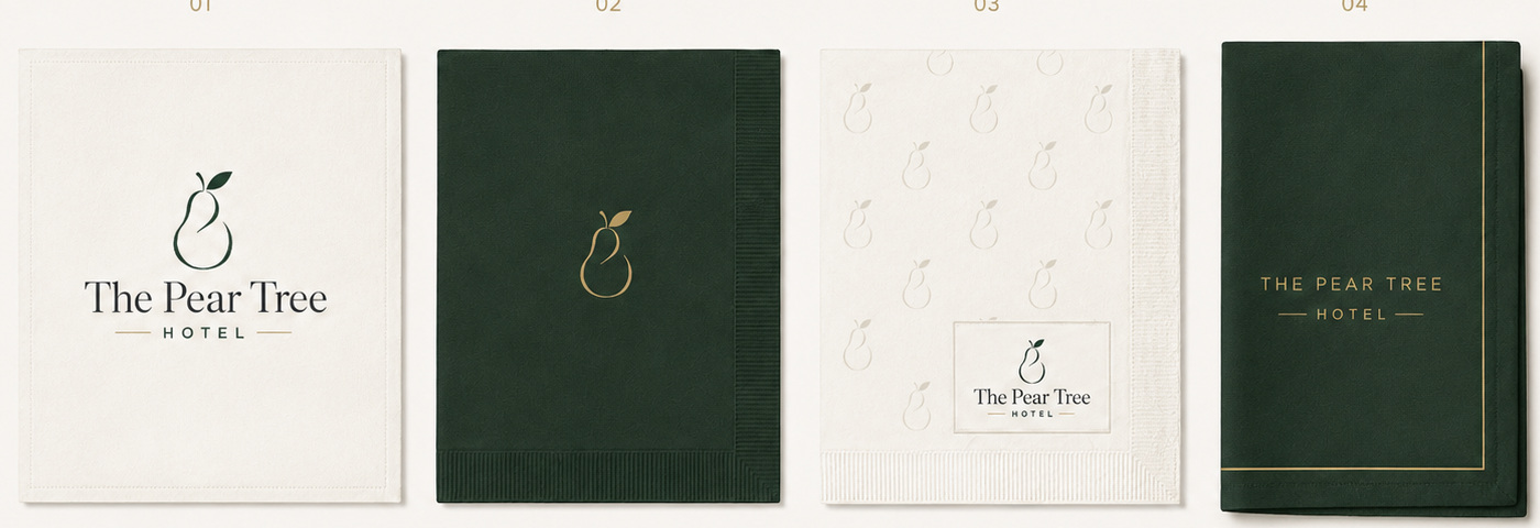
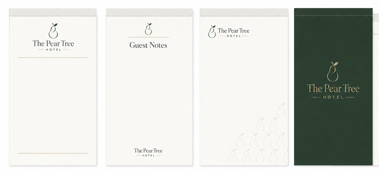
A modern boutique hotel identity system designed for an independent UK hotel, covering guest collateral, hospitality print pieces, signage, stationery and smart casual staff uniform ideas.
The aim was to create a clean, modern identity for an independent hotel that feels smart, warm and boutique without becoming overly formal. The project developed a full visual direction for guest facing items, internal use and portfolio presentation.
The brand needed to work across room key tags, menus, door signs, beer mats, napkins, A5 guest note pads and staff uniforms.
The visual identity uses a refined pear mark, restrained typography and a calm neutral palette. The logo is primarily applied in black or white for consistency, with deep green and muted gold used as supporting colours across the broader brand system.
The finished concept presents The Pear Tree Hotel as a calm, smart and welcoming boutique hotel brand. The identity is flexible enough to work across printed guest items, signage, food and drink materials, stationery, staff presentation and digital portfolio display.


