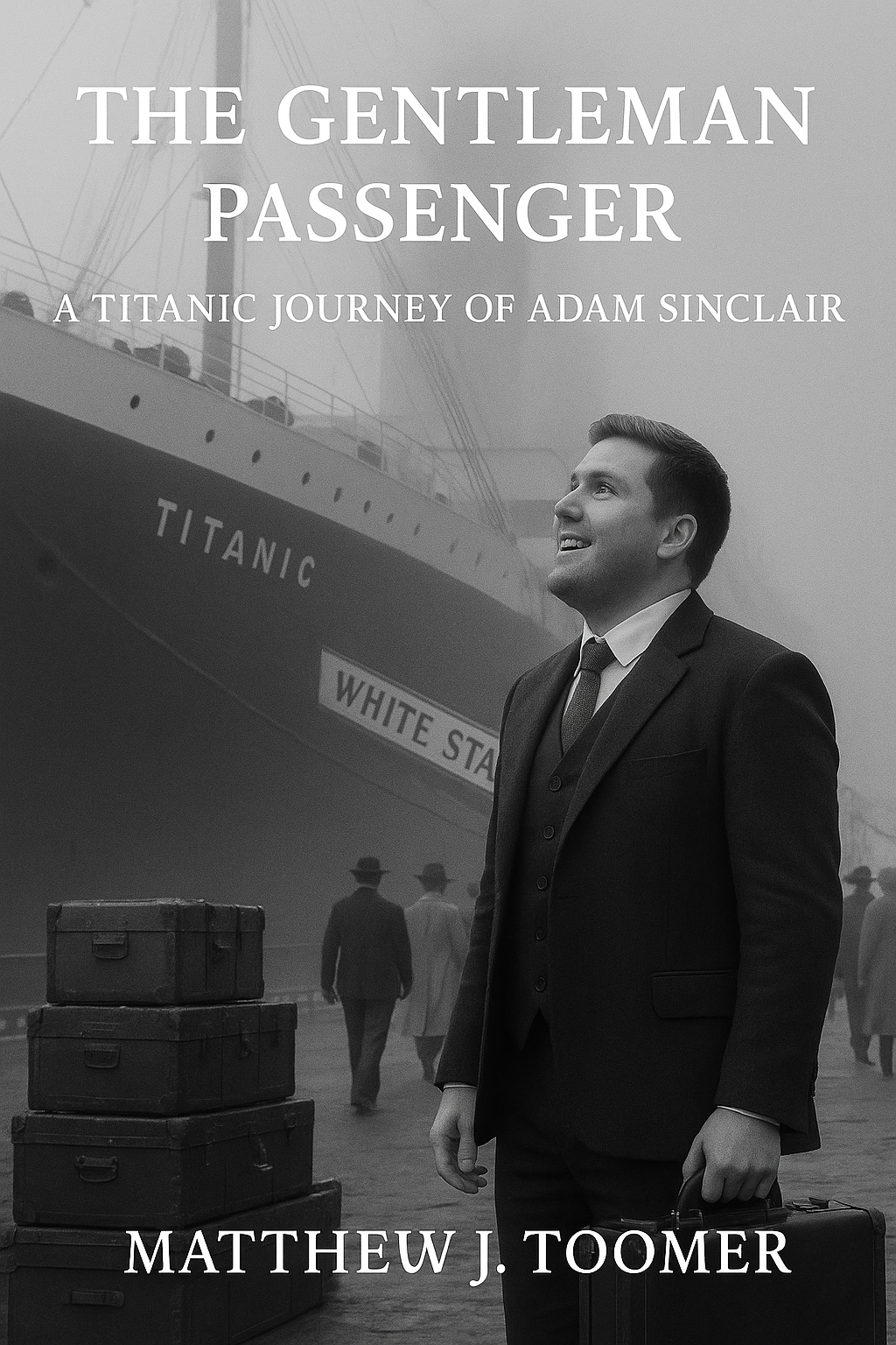
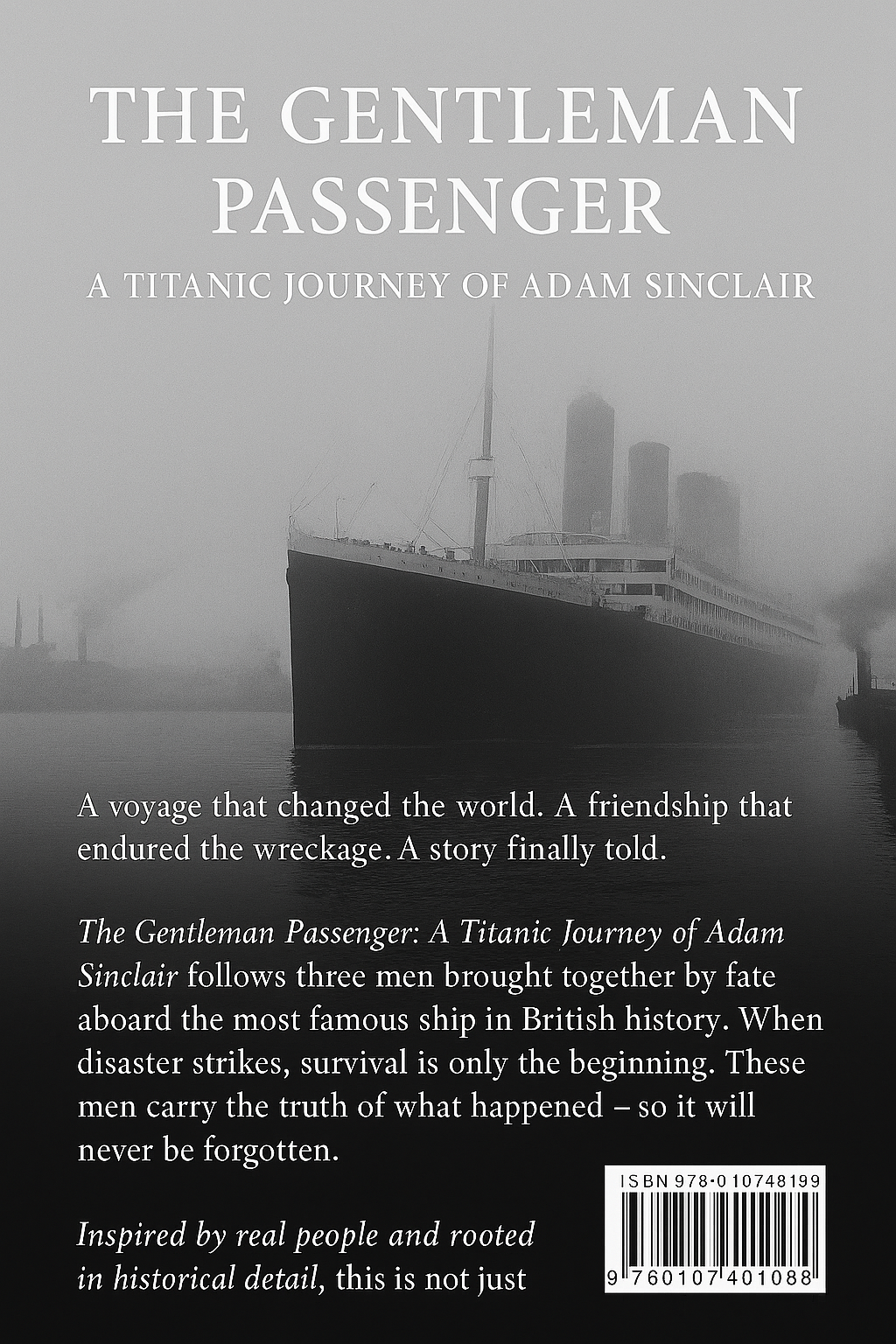
The client commissioned a full cover design for a historical fiction novel set aboard the RMS Titanic. The book, titled The Gentleman Passenger: A Titanic Journey of Adam Sinclair, follows the story of three young men—Adam, Matt, and Mikey—during their voyage on the ill-fated ship. The brief called for a cover that felt cinematic yet rooted in historical accuracy. It needed to evoke the scale of the Titanic, the period setting, and the personal journey of the central character.
The front cover was to feature a photorealistic image of a young man (Adam) standing at the dockside in 1912, looking towards the Titanic. The rear cover required an image showing the ship with dockside crowds, reinforcing the historic atmosphere. Typography had to match the Edwardian era, with a clean, elegant finish suitable for both print and eBook formats.
Design Process:
Research: The project began with extensive visual research into Titanic-era imagery, Edwardian fashion, and maritime settings to ensure historical accuracy.
Image Composition: Using AI-generated imagery based on character descriptions and historical references, multiple compositions were tested. Special attention was given to era-appropriate lighting, facial detail, and backdrop accuracy.
Typography & Layout: Typefaces were chosen to echo early 20th-century design trends, with a refined serif for the title and subtle embellishments to reflect the tone of the narrative. Spine and back cover layouts were created to allow for seamless formatting across both paperback and digital editions.
Revisions: The client was closely involved at every stage. Adjustments were made to facial features, ship detail, and clothing until the cover met both creative and historical expectations.
Client Feedback:
“This cover completely captured the vision I had for the book—actually, it surpassed it. The detail is spot-on, and the mood is exactly what I imagined: personal, cinematic, and evocative. It feels like something you’d see on a film poster or in a historical museum shop. The character looks exactly right, the ship is imposing but not overwhelming, and the overall finish is professional and emotionally powerful.”
The final product was delivered in both print-ready and ePub-compatible formats, with alternate crops for promotional use. The cover now appears across the author’s online platforms, and the printed version was described as “exceptionally sharp and rich in tone.”


