

Brief:
The Landing, a stylish new restaurant in the heart of Reading, approached me to create a bold and inviting flyer for their grand opening campaign. The brief was simple: make it luxurious, modern, and unmissable. The flyer needed to reflect the vibrant interiors of the venue while clearly promoting a 25% discount available during the opening week.
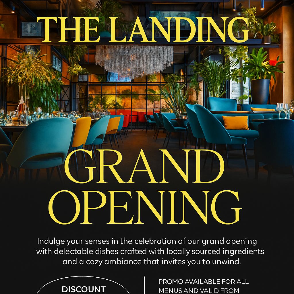
Design Approach:
I chose a high-resolution hero image that showcases the restaurant’s eclectic mix of plush seating, lush greenery, and sophisticated lighting. This instantly sets the tone for what guests can expect — a contemporary, upscale dining experience.
To contrast the rich, colourful interior, I went with a sleek black background in the lower half of the flyer to provide visual balance and make the text pop. The use of a large serif font in a warm yellow hue gives the design a premium, confident feel without being pretentious.
Key Elements:
Striking Typography: The “Grand Opening” headline is bold and elegant, catching the eye immediately.
Promo Highlight: A clear, well-spaced callout for the 25% discount offer, with dates prominently shown for easy reading.
Atmosphere-First Imagery: The choice of photography places the viewer directly inside the restaurant, creating an emotional connection and desire to visit.
Practical Details: Website, address, and booking encouragement included with a clean layout that avoids clutter.
Outcome:
The flyer has been used across print, digital newsletters, and social media, receiving positive feedback for both its aesthetics and clarity. It successfully sets the tone for the restaurant’s branding and opening message, with early reports of strong table bookings during the promo period.


