Helene Paquet Florist
Project Overview
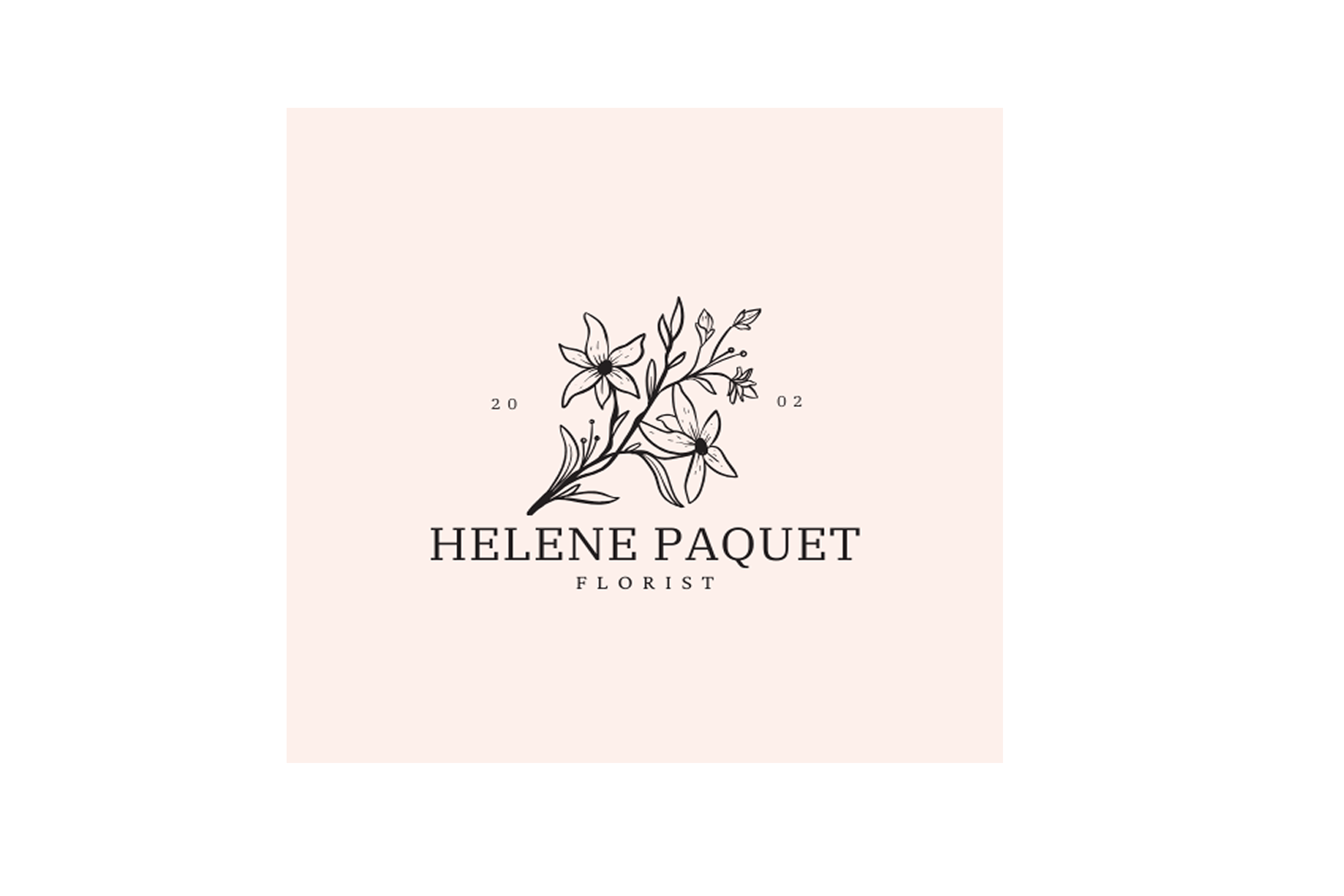
Helene Paquet Florist is a boutique floral business established in 2002, specializing in elegant floral arrangements that celebrate natural beauty. The brand wanted a timeless logo that encapsulates its refined and personal approach to floral design while being versatile for use across various platforms.
Logo Design
The logo features an intricate floral illustration of lilies, a symbol of elegance and purity, which ties closely to the brand’s identity. The delicate linework complements the minimalist serif typography, creating a harmonious blend of sophistication and simplicity. The choice of a soft blush background enhances the natural and inviting aesthetic.
Key Design Elements
Floral Illustration
Typography
The word “Florist” is presented in a lighter style, drawing focus to the name while maintaining balance.
Subtle Branding Touch
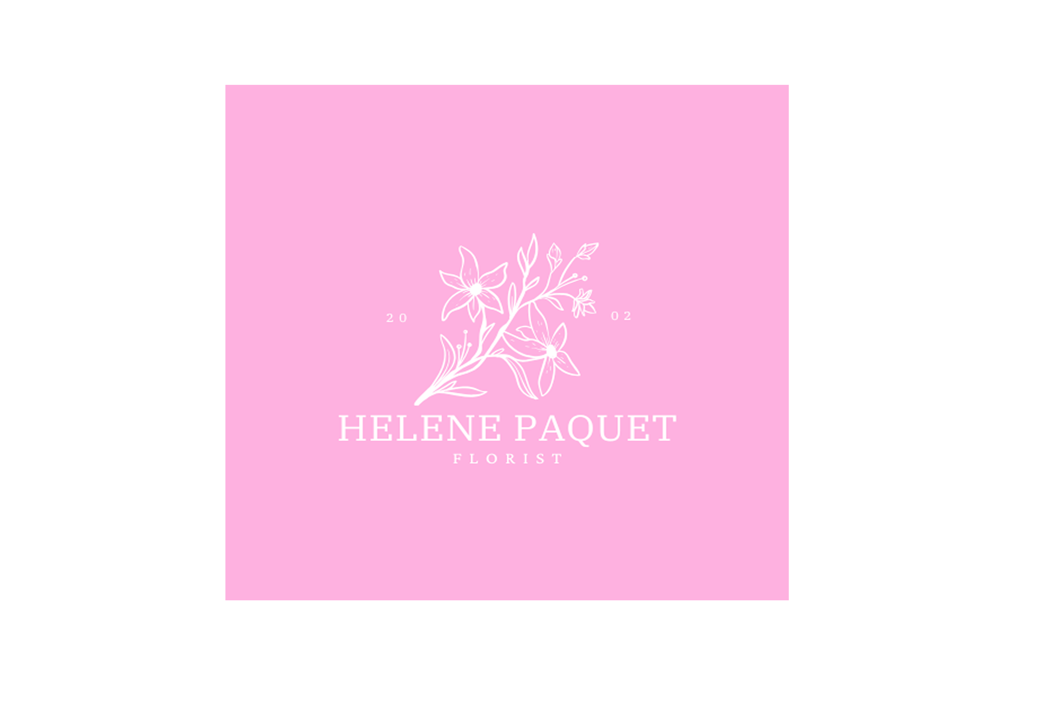
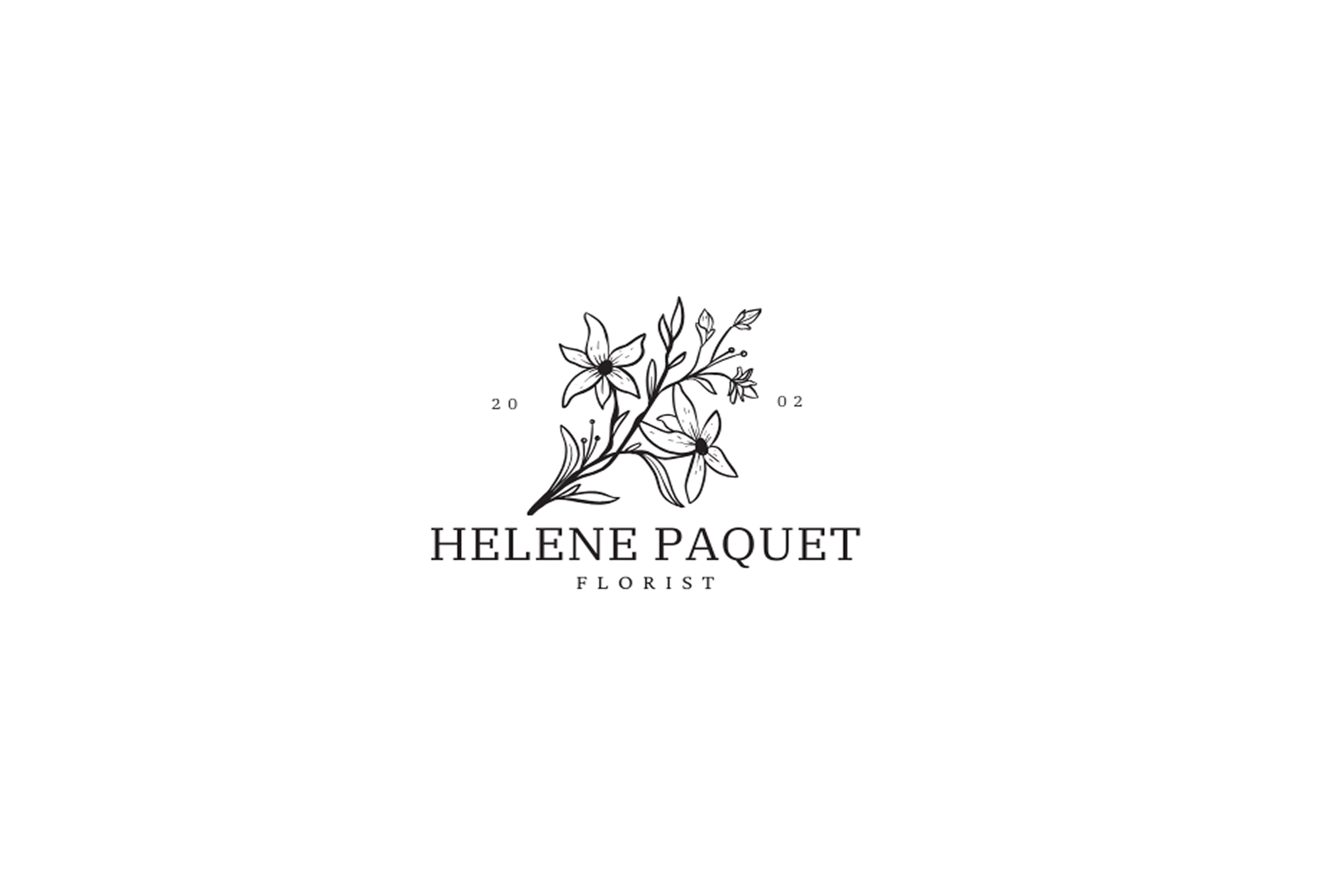
Versions for Versatility
To ensure the logo fits a variety of uses, several versions were created:
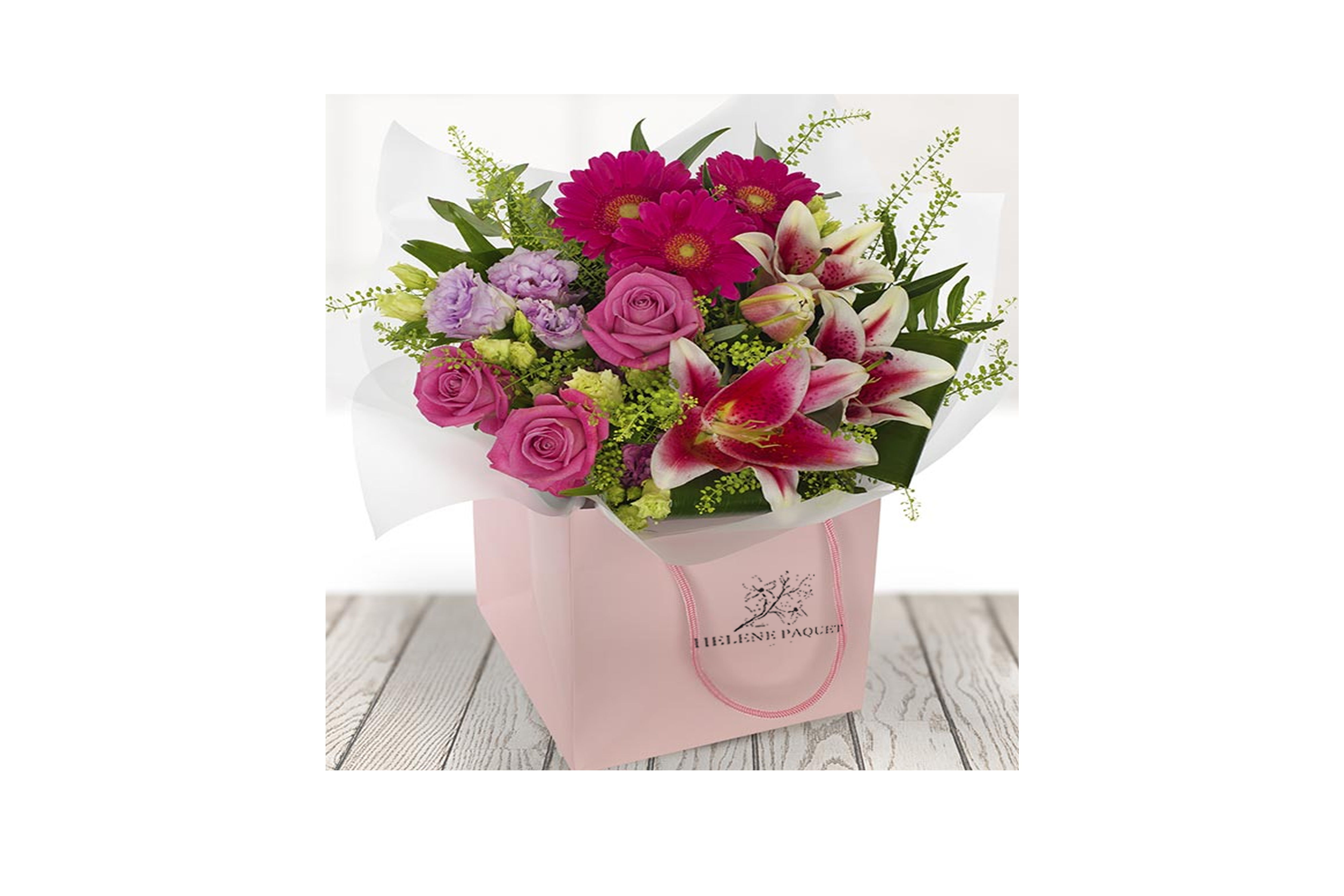
Results
The final branding successfully communicates Helene Paquet’s dedication to elegant craftsmanship and personalized service. It resonates with their target clientele, who value sophistication and artistry in floral design.
Client Feedback
“Absolutely thrilled with the design! It perfectly captures the essence of my business and feels both timeless and fresh. The different versions fit seamlessly across all my branding needs.”


